
No single baseball cap color is best for every wearer or brand. Black, navy, gray, and other neutrals are easy starting points when you want a cap that works in many settings. Brighter colors can help a team or event stand out, while a carefully chosen base color can make your logo easier to read. To make a useful choice, consider the cap’s purpose, your audience, the artwork, and how the color looks on the actual fabric.
If you are choosing colors for a staff program, team, or merchandise collection, start with the job each cap must do. A good-looking color on a screen can change when it appears on textured cotton, smooth polyester, a curved crown, and a stitched logo. The goal is a color combination that still works when someone puts the finished cap on.
Baseball Cap Colors: Quick Selection Guide
Use these directions to narrow your options before ordering swatches or samples. They are starting points rather than fixed rules; your existing brand palette and the cap style can lead you somewhere else.
| Your Goal | Good Starting Colors | What to Check |
| Everyday versatility | Black, navy, gray, muted neutrals | Whether the shade suits the rest of the collection |
| Staff or corporate wear | Navy, black, charcoal, brand neutrals | Consistency with uniforms and logo readability |
| Team identity | Official team colors or a neutral base with team-color details | Accuracy of the approved colors across cap and decoration |
| Promotional event | Bright colors or high-contrast combinations | Visibility, audience fit, and sponsor artwork |
| Lifestyle merchandise | Beige, earth tones, muted colors, or a collection-led palette | Fabric texture and how the cap fits the assortment |
| Clear logo display | A base color that separates visually from the logo | Actual artwork size and decoration method |
If you have to choose only one color, test it against the widest range of intended wearers and uses. If the program supports two, a restrained everyday option and one stronger brand color often give buyers a clearer choice than two nearly identical shades.
What Baseball Cap Color Goes With Everything?
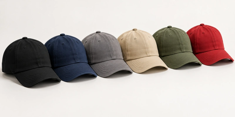
No cap literally goes with every outfit, uniform, or logo. But dark and muted neutrals tend to be easier to coordinate because they do not compete strongly with the surrounding colors. If you need one practical starting color for a mixed audience, black, navy, and gray deserve a look. Beige and other earth tones can also work across casual collections, though their exact shade matters.
Black
Black is a straightforward base for a broad wardrobe and many brand systems. It can make a light logo stand out, and it often feels appropriate for staff caps or simple merchandise. The tradeoff is that a black logo can disappear unless you introduce a difference in shade, texture, or decoration. Dust, lint, and fading may also be more visible on some black fabrics, so inspect the chosen material rather than assuming it will always look pristine.
Navy
Navy offers a dark base without the starkness of black. It can work for clubs, uniforms, and everyday products, particularly when it already appears in your brand palette. Check it beside your actual logo colors: some dark blue artwork loses separation against navy even if the colors look distinct on a monitor. Also specify the shade clearly, since a deep navy and a brighter blue create different impressions.
Gray
Gray gives you a flexible middle ground. A medium gray can support both light and dark details, depending on the exact tones; charcoal behaves more like a dark cap, while pale gray behaves more like a light one. Fabric texture can change the appearance of gray noticeably. Heathered, washed, and smooth materials should be reviewed as different options rather than treated as interchangeable versions of one color.
Neutral and Earth Tones
Beige, tan, brown, and muted olive can feel natural in casual or outdoor-oriented assortments. They are useful when you want a softer base than black or navy, but “neutral” is not one precise color. A warm beige may clash with a cool white logo; an olive cap may work with one green brand mark and obscure another. Place the cap swatch beside your garments and artwork before calling it the universal choice.
White can coordinate with many palettes, but it is not always the easiest operational choice. Marks and stains can show readily, and a pale logo may need more contrast. It can still be an excellent option for a clean retail design or a dark, legible mark when the intended use suits it.
How to Choose the Right Baseball Cap Color?
The best color baseball cap for your project depends on what you are trying to achieve. Instead of starting with a list of fashionable shades, work through the use, brand palette, logo, and collection. This order also helps you explain the decision to a supplier and approve a sample with fewer ambiguities.
1. Start With the Intended Use
For an everyday cap, you may favor a shade that works with several outfits. For staff wear, the color should sit comfortably alongside uniforms and remain recognizable across locations. A sports team may need a specific official color, while a promotional event may value visibility at a distance. A retail collection can justify several colorways if each has a clear role and enough expected demand.
Think about the wearing environment too. A white cap used outdoors may show grime sooner than a darker one; a very dark cap in strong sunlight can feel different from a pale version, though comfort also depends heavily on fabric, construction, airflow, and conditions. Color alone cannot establish performance. Make the final comparison using the intended cap material and representative wearers.
2. Match the Color to Your Brand Identity
If your brand has established colors, decide whether the cap body should reproduce one of them or provide a quiet background for them. Repeating the primary color can strengthen consistency across merchandise. A neutral cap can be more flexible when you already use several logo colors, serve different teams, or want one product to work with many outfits.
You do not have to make the entire cap one brand color. A coordinated visor, back strap, eyelet, or stitch color may carry the identity while leaving the crown versatile. Such details should be checked on the selected pattern and quoted for the actual order. Do not assume a precise shade on a screen will be available in every fabric. Share an approved physical reference when color accuracy matters.
3. Check the Contrast Between the Cap and Logo
Look at the finished logo at the size people will actually see. A light logo often separates clearly from a dark cap; a dark logo can read well on a light or neutral base. Multicolor artwork may benefit from a quieter crown color. Tonal decoration intentionally gives you less contrast, which can look restrained but may reduce legibility at a distance.
None of these is an absolute rule: thread sheen, patch edges, print coverage, and the artwork itself can change the result.
| Logo Direction | Cap Color Starting Point | Approval Check |
| Light logo | Darker cap | Confirm fine details remain visible |
| Dark logo | Light or mid-tone cap | Check the mark in outdoor and indoor light |
| Multicolor logo | Quieter base color | Ensure cap and logo do not compete |
| Tonal logo | Nearby shades | Check legibility at the intended viewing distance |
The baseball cap logo design guide covers artwork size, placement, and production choices in more detail. Here, your decision is the visual relationship between the base and the mark. Compare the complete decorated cap, since a digital overlay cannot show the full effect of stitching, patch texture, or curved panels.
4. Think About Your Audience and Collection
Your buyers may need different things from the same cap. A corporate uniform requires a consistent, approved look. A club shop may offer one subdued color and one team color. A lifestyle range might pair a washed neutral with a brighter seasonal accent. Choose the combination that supports the collection’s purpose rather than making assumptions about what a demographic group supposedly prefers.
If you offer several colorways, check that they belong together. Repeat a shared logo scale, cap silhouette, or trim treatment so the line feels deliberate. Also consider whether the decoration must change between dark and light caps. One logo color may not read clearly on every base; preparing a light and a dark artwork version can solve that problem when your brand rules allow it.
Popular Baseball Cap Colors and When to Use Them
These are familiar color directions, not a verified ranking of sales or annual trends. Use the examples to shortlist combinations for your particular audience and logo.
Black gives you a versatile dark base for everyday, staff, and merchandise caps. It often supports lighter embroidery well, but a black-on-black mark needs careful sampling if readability matters. Navy has a similarly broad range of uses and can feel at home in team or corporate programs; verify that blue logos remain distinct. White can deliver a clean presentation for dark artwork, provided the likely wear and care requirements suit a light cap.
Gray is useful when you want neither a very dark nor a bright cap. Check whether a heather texture changes how the logo looks. Beige and related neutrals can support casual retail and outdoor collections, particularly with darker artwork.
Red, orange, and other bright colors can make a team or event more visible, but the precise shade should answer to your brand system rather than a generic color label. Green and earth tones range from vivid team greens to muted olive; those variations have very different effects on logo contrast.
If you need a color that works across many settings, begin with a neutral and test it. If you need immediate recognition, start from your brand or team palette. Do not label a color “most popular” without sales data for the market and period you mean.
Light vs Dark Baseball Cap Colors: Which Is Better?
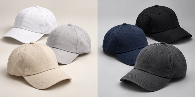
Dark caps often give light artwork clear separation and a more restrained appearance. Light caps can make dark or saturated artwork easier to see and may give a collection a cleaner visual tone. Dirt can be more noticeable on light fabrics, while lint, dust, or fading may be noticeable on some dark ones. These are tendencies, not guarantees: fabric texture, finish, care, and use environment all matter.
For outdoor use, do not decide from color alone. The cap’s shell, lining, ventilation, sweatband, and fit can affect comfort. If you are comparing two colorways for an active program, make them in the same construction and try both under similar conditions.
That gives you a more useful result than comparing unrelated product photographs. For branding, test your intended logo version on each cap color at real size. A dark-versus-light decision becomes much easier when you can see the finished samples side by side.
Solid, Two-Tone or Multi-Color Baseball Caps?
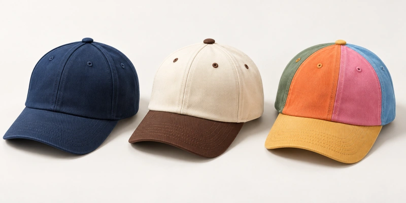
Color layout affects what your customer notices first. A solid cap keeps the main shape simple; a two-tone design can emphasize the visor, panels, or mesh; a multicolor version can carry more of a team or collection palette. Use extra colors because they improve the design, not merely because they are available.
Solid-Color Caps
A single base color can give a logo the clearest role, especially for staff programs, straightforward merchandise, and collections with strong artwork. “Solid color” should still be specified carefully: matching crown, visor, button, and closure components may involve different materials. Check the approved sample for visible shade differences instead of assuming a color name guarantees a uniform finish.
Two-Tone and Multi-Color Caps
Two-tone caps can use a contrasting visor or panel to introduce a second team color without making the full crown busy. Multicolor caps give you more room for a defined design system, but every additional component increases the need to review the combination.
Decide which color is dominant and which is an accent. Then check the logo against the panel on which it actually sits. A bright visor does little for a logo that disappears against a similarly colored crown.
How to Choose Colors for Custom Baseball Caps?
For a custom order, move from the base cap to the decoration and then to a physical color approval. HENGXING offers multiple color options for custom headwear. Available colors should be confirmed for the selected cap style, fabric, and order requirements. A color shown in an online gallery does not establish stock for every style or an unrestricted color-matching service.
Choose the Base Cap Color
State the cap style, shell material, and intended use before selecting the shade. The same named color can look different on cotton twill, nylon, mesh, or a washed fabric. If you are choosing between a structured and a soft front, inspect the color on both finished shapes. Ask which materials and shades are available for that construction and quantity, then identify the exact base color for each planned colorway.
Choose the Logo and Decoration Color
Supply your actual artwork, including approved light and dark versions if you use them. Embroidery thread, print, and patch materials may reproduce a color differently from the cap fabric. Choose the decoration method with the artwork and base color in mind, and inspect fine lines and lettering after production. If you need several logo placements, verify the combination on front, side, and back rather than approving each color in isolation.
Decide Between Tonal and High-Contrast Branding
Tonal branding uses nearby shades or subtle texture differences. It can suit a restrained retail cap, but you should check whether the mark is still readable at the distance that matters to you. High-contrast branding separates the mark more clearly and can help sponsor or team identification.
You can also combine the approaches: keep the main logo visible and use quieter secondary details. Make the choice according to the product’s job, not a rule that every logo must stand out as strongly as possible.
Confirm Color on the Selected Fabric and Cap Style
Before bulk production, compare a physical sample with your approved color reference in consistent lighting. Review the cap body, visor, thread or patch, closure, and any contrasting panels together. Record the selected material and color reference in the order specification. Screens, studio photographs, and fabric swatches are useful for narrowing choices, but the decorated finished cap is the approval point for the overall effect.
If you are preparing a buying brief, send the cap style, quantity by color, fabric direction, logo artwork and placement, destination, and target date. The hat materials guide can help you discuss how a fabric changes the look of a color. You can then use the custom baseball caps range to review suitable constructions and request a sample for the chosen combination.
What Do Different Baseball Cap Colors Communicate?
Color associations are contextual, not fixed psychological facts. Black often reads as classic or restrained; navy can feel familiar in sports and uniforms; white may look clean and simple. Gray is typically understated. A bright red or orange cap may draw more attention, while muted green and earth tones can suggest an outdoor or casual direction.
The fabric, logo, styling, and audience can change each impression. Use these associations to guide a first shortlist, then judge the actual cap beside the rest of your brand materials.
FAQs
What Is the Best Baseball Cap Color?
There is no universal winner. Black, navy, and gray are versatile starting points. For a custom cap, the better color is the one that suits your intended use, audience, brand palette, and logo. Approve the combination on the actual material before committing to a larger order.
What Color Baseball Cap Goes With Everything?
Black, navy, and medium gray are often easier to coordinate with many outfits and brand settings. Beige and muted earth tones can also work well for casual ranges. The precise shade, fabric, and logo can change how versatile the finished cap feels.
Should I Choose a Light or Dark Baseball Cap?
Choose according to the logo, use environment, and visual direction. Dark caps often support light marks; light caps often support dark marks. Compare dirt visibility and finished comfort on the selected fabric, and test both colorways if the decision is important to the program.
How Do I Choose a Baseball Cap Color for a Logo?
Place the logo at its intended size on the proposed cap style. Check visual separation, fine detail, and the decoration method. A quieter base can help multicolor artwork; tonal designs need an explicit legibility check. Approve a decorated physical sample before finalizing the colors.
Make the Color Work on the Finished Cap
Start with what your cap must do, then choose a base color, logo treatment, and color layout that serve that purpose. Versatile neutrals, bright team colors, and subtle tonal designs can all be right in different programs. Your final decision should come from the selected fabric and decorated sample, with the color reference recorded for the order. When you are ready to develop the specification, share your requirements through HENGXING’s custom baseball caps page.