
A good baseball cap logo design must work on a curved, three-dimensional product, not just on a screen. Start with the cap style and the placement where people should see the mark. Then check the usable decoration area on that specific pattern, choose a decoration method that suits the artwork, and approve a physical sample.
A flat mockup is useful for discussing direction, but it cannot confirm how small lettering, a center seam, or a soft front panel will behave in production. If you are buying caps for a brand, team, or distribution program, make these decisions before committing to quantities across multiple colorways.
Start With the Cap, Not the Artwork
The same logo can look different on a shallow, soft-front cap and on a taller cap with reinforced front panels. Crown height changes the visible space above the brim; panel seams can interrupt or frame the design; fabric texture affects the clarity of stitching or printing. Before resizing the logo, choose a reference cap and identify the intended crown profile, panel layout, fabric, and front support.
You do not need to become a pattern maker, but you do need to show your supplier the cap you are specifying. A front photo tells only part of the story, so include a side view and, if the silhouette matters, a photo of the cap being worn. If you have several existing styles to choose from, compare your artwork on each at its intended finished size.
The broader custom baseball caps range helps you discuss cap options, while this guide focuses on preparing your logo for a specific style.
A structured front can provide a firmer surface for certain decoration methods, but it does not guarantee that every design will work. A soft front may suit a relaxed collection, but its drape can affect how a dense or heavy decoration sits when worn.
You can explore structured baseball caps if a defined front shape is central to the design. Whichever style you choose, approve the logo on the proposed pattern rather than assuming a result based solely on the terms “structured” or “unstructured.”
Where Should a Logo Go on a Baseball Cap?
Front-center placement is usually the first option a buyer considers because it remains visible in a straight-on view. Side placement can carry a small secondary mark without competing with the primary brand identity. A rear logo can appear above or near the closure, depending on the available space and the cap pattern.
These are design positions, not fixed decoration areas: seams, ventilation eyelets, the closure, and the crown shape can all reduce the usable space.

For each location, ask what the viewer should recognize at a glance. Your full company name might need the front, while a simple icon or initials could work on the side or rear. If the cap will be photographed mainly from the front, do not place the only identifying mark where it will rarely be seen.
If the cap is part of a uniform or repeat retail range, check that placement remains consistent across the actual sizes or closure configurations you intend to order.
| Location | Useful Design Role | What to Check |
| Front center | Main logo or short wordmark | Crown height, panel seams, finished dimensions, and balance above the brim |
| Front offset | Asymmetric artwork or a small mark | Visual balance on the worn cap and distance from panel seams |
| Left or right side | Secondary symbol or short text | Eyelet, seam, and side-panel position on the actual pattern |
| Rear | Small identifier or secondary branding | Available area relative to the closure and rear opening |
| Brim or underbrim | Limited decorative detail | Fabric, curvature, visibility, and suitability of the chosen method |
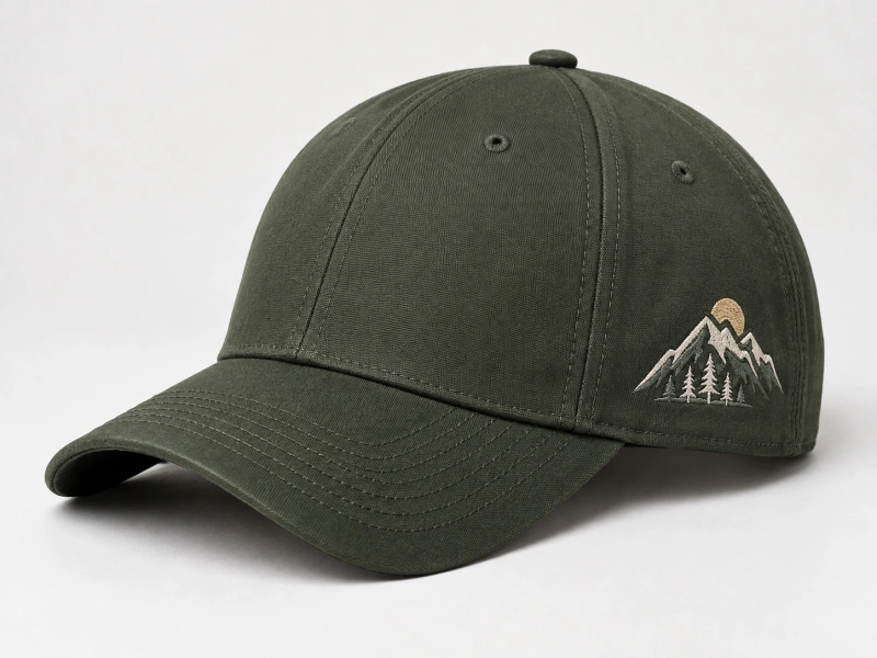
Do not fill every available position simply because it can be decorated. Use one primary mark and add a secondary mark only if it helps the buyer or wearer identify the product. If you want artwork on the brim, review the baseball cap brim guide to understand how the top, underside, edge, and curve affect the finished appearance. For a closer look at panel names and seams, see the parts of a baseball cap guide.

How Large Should the Logo Be?
There is no single useful maximum logo width that applies to every baseball cap. The usable area depends on the selected crown pattern, its height and seams, the proposed decoration method, and the clear space the mark needs around it. A logo can technically fit inside a panel and still look cramped or distorted once the cap is worn. Give your supplier a target finished width or height, then ask them to check it against the chosen pattern.
Begin with a scaled proof positioned on the cap. Place the design where it should sit, measure its outer edges, and leave adequate space around lettering and any raised elements. Check the width and height together: shrinking a broad wordmark to fit a narrow panel can make its letters unreadable, while increasing its height may push it too close to the crown seam or brim.
If your brand guidelines specify minimum clear space, apply that rule to the finished cap rather than assuming it transfers unchanged from a flat page.
Small details deserve particular attention. Thin strokes, tight counters within letters, and narrow gaps between shapes may change during embroidery or another production process. Do not solve every problem by making the entire logo larger. You may get a cleaner result by simplifying the cap-specific version of the mark, separating the icon from a long wordmark, or choosing a different placement.
Keep the original brand artwork and the proposed cap adaptation together in the approval record so that a later reorder does not unintentionally use the wrong version.
If several cap styles share one campaign, do not impose a single dimension before checking all the patterns. You may be able to maintain a consistent visual proportion while adjusting the actual size by style. Record the final dimensions and placement for each approved sample.
The factory should confirm the available decoration area and process limits for the specific cap; general measurements from another supplier do not establish a Hengxing specification.
Five-Panel and Six-Panel Front Logo Layouts
Many six-panel crowns have a seam running through the front center. That seam can affect how small lettering, a patch edge, or raised embroidery sits on the cap. A five-panel construction arranges the front differently, but you should not assume that every five-panel cap offers a single seamless rectangular decoration field. The usable space depends on the exact pattern.
If your artwork is a centered icon, place it at the full proposed size on both patterns and view it from the front and at an angle. Check whether the seam crosses a critical detail. A thick raised element over a seam may require a design or placement adjustment; a patch may require attention to its border and how it follows the crown.
A narrow wordmark can present a different issue: even if the seam falls between letters, the finished spacing may look uneven when the cap curves around the head.
Panel count is only one decision. Crown profile and front reinforcement also shape the visual result. A deeper structured cap may present the artwork on a more defined front than a relaxed soft-front cap with the same number of panels. If your project requires a precise front silhouette, compare decorated physical samples.
Our parts of a baseball cap guide explains the underlying component terms; your approval should focus on the selected cap and logo together.
Choose a Decoration Method That Fits the Design
Start with what the mark needs to communicate. Fine detail, a bold raised emblem, and a color-rich illustration do not call for the same treatment. Hengxing presents flat embroidery, 3D puff embroidery, patches, and selected printing or heat-transfer options among its customization options. Actual suitability must be checked against the artwork, fabric, construction, and chosen placement.
| Method to Discuss | When It May Suit Your Design | What to Test on the Chosen Cap |
| Flat embroidery | A logo that needs stitched color and defined shapes | Small text, thin lines, seam interaction, and fabric puckering |
| 3D puff embroidery | A bold mark with enough room for raised forms | Edge definition, letter spacing, depth, and front-panel support |
| Embroidered patch | A separate badge with a stitched look | Border shape, attachment, thickness, and how it follows the crown |
| Woven patch | Fine woven detail in a badge format | Readability at actual size, border finish, and attachment |
| Printing or heat transfer | Artwork suited to an approved fabric and surface | Surface texture, placement, hand feel, and sample appearance |
The table is a starting point for discussion, not a compatibility guarantee. On textured fabric, a printed line may look different from the digital proof. On a soft front, dense decoration can affect the drape. If your design contains very small type, ask for a test at the proposed size rather than relying on a generic claim that one method is “best.” Our flat embroidery vs 3D puff guide goes deeper into those stitched effects, while woven vs embroidered patches explains the visual differences between the two badge approaches.
Be deliberate about color. Specify the brand color reference, then compare the physical thread, patch, or print sample under normal viewing conditions. A color displayed on a screen is useful as a reference, but it cannot serve as final approval for a physical material. If exact color matching is critical, discuss available materials and an agreed comparison standard during sampling.
Prepare Artwork for Sampling
Send the best original artwork you have. A vector master is helpful because the supplier can inspect the shapes and scale the design without relying on a small screenshot, but accepted file formats and any redrawing services should be confirmed with the project team. If you only have a raster file, provide the highest-quality original rather than an image copied from a website or social media post.
Your handoff should include the artwork version, intended colors, target finished dimensions, and proposed placement on a reference cap. Add a photo showing how the cap is worn and a simple placement drawing if the mark must align with a seam or panel edge. Clearly label the front, left, right, and rear views. If the cap will have multiple marks, distinguish the primary logo from secondary labels or icons.
Describe what may change and what must remain fixed. You might allow a minor size adjustment to preserve legibility while requiring the wordmark proportions to remain intact. Or you might accept a simplified cap version of a detailed logo if the small elements cannot be produced cleanly. Record those decisions; a vague instruction to “make it look good” leaves too much room for later disagreement.
If you are still choosing a decoration method, ask the supplier to recommend a sampling approach for the specific artwork and cap. Share expected quantities by style and color, target market, and timing so the proposal fits the order rather than a one-off rendering. You can send this brief through the custom baseball caps inquiry once the reference cap, logo, and open decisions are organized.
Approve the Physical Sample Before a Larger Order
A digital mockup shows approximate scale and placement. The physical sample shows whether the artwork reads clearly on the curved crown, whether the cap still fits as intended, and whether the finished decoration has the visual weight you want. View the sample both on a wearer and off the head. Take front, side, and close-up photos under consistent lighting so the approval can be shared with everyone who signs off on the range.
Check the position first. Is the logo centered as intended, with enough room above the brim? Does a side mark sit clear of an eyelet or seam? If the design crosses a front seam, inspect the finished alignment rather than assuming the digital file represents the sewn result. Then check proportions, letter legibility, edge definition, color, and any visible puckering or crown distortion.
Ask what changes are required before approval. A design might need simpler lettering, a smaller badge border, another position, or a different cap pattern. Make those adjustments in the sample record and approve the revised physical result.
Retain the approved cap, artwork version, placement notes, and measurements for repeat orders. Do not treat an emailed image alone as the complete production reference when tactile feel, raised depth, or crown shape is part of the decision.
Developing the logo for your first product? The hat business startup guide shows how artwork, sampling, pricing, and the first order fit together.
Copyable Baseball Cap Logo Design Brief
Use the following fields when sending an initial inquiry. Fill in what you know and mark uncertain items as open for review.
- Project and audience: brand, collection, or program; intended wearer and sales market.
- Cap reference: photographs or sample; proposed panel layout, crown profile, structure, and fabric.
- Artwork: original logo file, version name, brand colors, and any approved simplified variation.
- Placement: front center or offset, left or right side, rear, or brim; identify the main and secondary marks.
- Size: target finished width and height, including any brand clear-space rules and a placement sketch.
- Decoration: preferred method or options to compare; note small text, fine lines, gradients, or raised elements.
- Order scope: estimated quantity by style and color, delivery destination, and target timing.
- Approval: who will sign off on the decorated sample and which details require a physical check.
Send the brief with your reference cap and ask which dimensions and decoration combinations the current pattern can support. For a multi-style order, request an approval record for each distinct cap-and-logo combination. This makes quotations easier to compare and preserves the details that matter when a design moves from a single sample to production.
FAQs
What Is the Best Logo Placement on a Baseball Cap?
The best position depends on what needs to be recognized and how the cap will be seen. Front-center placement often suits the primary mark, while side and rear positions can carry smaller secondary branding. Check the selected cap’s seams, eyelets, closure, and available area, then review a decorated sample at the proposed finished size.
Is There a Standard Maximum Size for a Front Logo?
No single maximum applies to every cap pattern or decoration method. Crown height, seams, panel shape, and the artwork’s proportions all affect the usable space. Give your supplier a target finished width and height, and ask for the limits of the actual cap and decoration process. Approve legibility and spacing on a physical sample.
Can a Logo Cross the Center Seam of a Six-Panel Cap?
It may be possible with some designs, but the seam can affect alignment, detail, and how a raised or attached mark sits. Place the artwork at its finished size on the selected pattern and have the proposed method tested. If the seam interrupts essential detail, discuss a revised size, position, or panel layout.
Is 3D Puff Embroidery Suitable for Small Lettering?
3D puff embroidery generally needs enough space for the raised forms to remain distinct. Very small or closely spaced letters may lose clarity, but a reliable minimum depends on the artwork and process. Ask for a test at the proposed size, and consider a flatter treatment or simpler mark if the sample is difficult to read.
What File Should You Send for Baseball Cap Logo Sampling?
Send the best original artwork available, preferably a scalable vector master if you have one, along with colors, target finished dimensions, and placement notes. Confirm the file types the project team accepts. A small screenshot alone may hide details that matter when the design is translated into stitching, a patch, or a print.
Turn the Design Into an Approved Cap
Your baseball cap logo design is ready for a buying decision when the cap style, mark, placement, finished size, and decoration have been approved together on a physical sample. Send your original artwork, a reference cap, proposed positions, target quantity, and delivery market through the custom baseball caps page. The available pattern and method can then be reviewed against the design you actually want to produce.